The aim of this blog is document our progress of our pop up store, to share inspiration and our creative thoughts.
Wednesday, 23 February 2011
Final Model
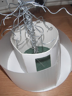
Please see below pictures of our final model. This model is scales 1:20 and has been measured to fit into the Victoria Gallery.
Creating our Final Model
Whilst creating the final model, I took photos of each individual stage, enabling you to see the processes in which took place to create the model
Please see images below:
Please see images below:
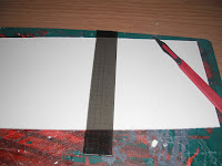
I began by printing out our auto cad drawings, and spray mounting them onto board. I then cut out each individual section of the model, as can be seen in the above pictured.


Music
What Natialie said about the music post i had on with words in i agreed with so i found this peace of music which is really relaxing and tranquil and could be played as people wander around the store reading and relaxing the exhibition.
relaxing music
relaxing music
We are now coming towards the end of the project and i think its gone really well, the presentation we have created really reflects our brand and im really pleased with the final outcomes.
Location
After confirming the final design, we then had to focus on the location, taking into account measurements of the space in which the pop up store will be places, and how the pop up store will look within that location.
Here are some photos of the Victoria Gallery (the location of our pop up store)

This is the glass roof of the building. I like this, as it will allow lots of light into our design, and also I think it will make the tree look good.
Here are some photos of the Victoria Gallery (the location of our pop up store)

This is the glass roof of the building. I like this, as it will allow lots of light into our design, and also I think it will make the tree look good.
This is the view from the first floor, down into the space in which the pop up store will be located. I think this space is perfect for our design as it is big and open. I think our design will work well in this space, as it is round, therefore visitors will be able to walk around the whole of the unit, enabling them to access all parts of the gallery.
This is a view of the space from the ground level. As you can see, this area is used by many people, therefore it is important to ensure visitors of the building have access to all areas of the gallery around our design.
Overall, after observing and measuring the location of our pop up store, I have concluded that our design will fit perfectly within the chosen space. I next went on to create specific measurements for our design, so therefore we are able to create scale drawings/models.
Overall, after observing and measuring the location of our pop up store, I have concluded that our design will fit perfectly within the chosen space. I next went on to create specific measurements for our design, so therefore we are able to create scale drawings/models.
First Model
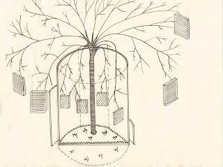
Once we had agreed on the design, as shown below in the sketches, we then went on to create a maquette of our design. This model is not to scale, as it is only to observe how the design looks in 3D format.
Please see pictures below:

We are happy with the design of this model and the way in which is looks in 3D format. I think the front plastic/glass skin is particularly effective, as it creates a walkway and makes the unit visually interesting and unique.
Tuesday, 22 February 2011
Scaled Drawings
Here are 2 scaled drawings that i have done. The first one is scaled 1:50 but after i had drawn it i realised it was too small for a model as it wouldnt show off as much detail as a bigger scaled model would. On it i have included the exact measurements we chose would be suitable for the pop up.
This next one is scaled 1:20. It is a perfect size because it isnt to big and isnt too small. When i came to scan this one on the computer, because the scale was bigger it wouldnt fit on the scanner so missed some of the branches off. I decided to include it anyway to show the size of the chosen measurements to scale.
Monday, 21 February 2011
Further Development of Unit Design
As can be seen in the previous post, we have agreed to go with the circular unit, which gives a flowing and tranquil effect. We now wanted to further our natural ideas, therefore we decided to incorporate an artificial tree within our design, which was influenced by an image as posted earlier in the blog.
We also wanted to incorporate glass/plastic into our design, which may be frosted or translucent. The reasons for using this material is because is will allow light through, giving a natural feel, however as it will not be completely transparent, visitors will want to go inside the shop, so that they are able to view the contents inside properly. This is a way to entice the visitors into the shop.
Another way of enticing the visitors into the shop is by creating an interesting, magical entrance. We want to do this by using skins of a glass wall and a solid opaque wall, to create a curved walkway for the visitor. This idea will create an experience for the visitor, adding to their magical and slightly surreal experience within the pop up shop.
Here are some further sketches of our developed idea:

This idea encorpoates the idea of having skins. The inner wall would be a solid opaque wall, and the outer wall (creating the walkway) would be a translucent material.
We also wanted to incorporate glass/plastic into our design, which may be frosted or translucent. The reasons for using this material is because is will allow light through, giving a natural feel, however as it will not be completely transparent, visitors will want to go inside the shop, so that they are able to view the contents inside properly. This is a way to entice the visitors into the shop.
Another way of enticing the visitors into the shop is by creating an interesting, magical entrance. We want to do this by using skins of a glass wall and a solid opaque wall, to create a curved walkway for the visitor. This idea will create an experience for the visitor, adding to their magical and slightly surreal experience within the pop up shop.
Here are some further sketches of our developed idea:
This is the first developed sketch, to show our tree idea. This idea does not however show any walkway or glass/plastic use.

This idea encorpoates the idea of having skins. The inner wall would be a solid opaque wall, and the outer wall (creating the walkway) would be a translucent material.
This third sketch shows the inside of our design. As can be seen, glass/astroturf has been used on the floor of our design, which has been mentioned previously in the blog. This sketch also shows the use of the trees branches to exhibit work.
Development of Unit Design
As can be seen in these sketches, we went with a circular base shape, however these sketches are not finalised, as there is no consistence in roofing door position, size etc....
I will next post our developments from these initial idea.
I will next post our developments from these initial idea.
Music
When people go into our pop up store we want them to feel like there away from all their stress and in total relaxation, so i thought this YouTube clip of this piece of music really related to how soft, calm and natural our brand is.
Moby - Porcelain
Moby - Porcelain
Finishing Touches to our promotion
Our brand name is Entwined and our brand is all about going on a magical journey and feeling excited and enticed by our pop up store, so for all our promotion we kept the brand logo the tree throughout. We also chose a font off 'dafont' website which really made our brand unique and special.
Our Font
This image of the tree is our brand logo which we used on all our promotion.
We adapted it on illustrator to relate to our brand by changing the opacity etc.
Our brand strap line we decided would be 'Artisitcally showcasing talent' as even though its not art we are promoting, what we are promoting and the way we are is very artistic and creative.
Sunday, 20 February 2011
tree tag
This is the tree tag i have created it has the same information as the poster. this would hang off a tree branch for people to pull off and read. The shape is in keeping with the natural trend of the pop up store we have chosen.
Lydia
Grass logos
These are the two final grass branding logos that i have come up with. I have used a a font from dafont.com called tree like and in-printed it into an image of grass. The other one is our brand logo. We have used this as a brand logo because it ties in with the tree in our pop up store, also the reason for choosing the font type.
These would both feature around preston to give hype about our pop up store.
Lydia
Entwined Brand Poster
I created this A3 poster so it could be stuck on trees as this really relates to the way our brand is going to be promoted. The poster really relates to what our brand is showcasing, creative writing talent, i used the tree on the poster again as this is our brand logo. Then used a font that would really compliment our brand, i used a newpaper article and changed the opacity in the background of the poster as i thought this was a nice touch, reflecting what our brands about.
Final Trend
We have now narrowed down our trends to a final one which reflects our brand the most, i have now created a trend analysis board to convey this trend. The trend is the modern craft trend as its really neutral colour pallette, and its use of expensive fabrics and detailed embellishments really reflected our unique brand.
As this trend is all about the little details that make up the trend.
As this trend is all about the little details that make up the trend.
This image really reflects the colour palette of the modern craft trend.
Thursday, 17 February 2011
Development
We have now developed our brand idea further as our concept is very natural and magical we have decided to now exhibit creative writing students work in our pop up store. As this relates more to the look and feel of our store, the concept of hanging the work on tress is still the same and the models and promotion are still the same, but we now have decided to call our brand name entwined as it really relates to the tree in the store and is a very magical, intreging word, just how we want our store to be.
Wednesday, 16 February 2011
i have began to create our poster on illustrator, we have decided to call the brand 'Finest' as its the cities finest work, then if the pop up store moved around the country we can change the city name infront of finest eg Liverpools finest, Preston's finest. The colours i have gone for on the poster are the colours of our pop up store very natural earthy browns and subtle greens. The poster really reflects what the brands about and what we are trying to achieve.
Tuesday, 15 February 2011
Grass
Hey just been playing around trying to give the impression of the cut out grass. Don't know what font to use or haven't though of a logo jus played around with shapes to give the impression of cut out grass. So if anyone has ideas for fonts or a logo let me know and il try it out. Will make the final ones more 3d when we have decided on a font and logo.
Lydia
initial sketches for tree tag
These are my initial sketches for the tree tag. thought it might be a good idea to keep with the natural theme we are going with and design the tags in the shape of leaves to hang on the trees.
Lydia
Promotion
This is a poster that i have found that incorporates the idea of pop up. The boxes that show the idea of a pop up sale are all cardboard giving the impression that they are not a permanent fixture and give the indication of moving. By having a 'pop up' sale makes the customer want to act fast because they know that it wont be there for long and they may miss out.
Lydia
Sunday, 13 February 2011
Brands using Nature to promote their products
I found this clip on YouTube of 'Urban Orchard' for Strongbow, the product doesnt relate to our brand but the way they have promoted it, hanging their beer on the trees, the tree is made out of unwanted wooden things like chairs, coat hangers etc, which is what makes it so different, and is like our recycling idea for our brand. The same concept is their and the way they created the tree is really unique, just how we want our pop up brand to be. The way they have promoted the clip also calling it 'Strongbow Season' relates it all back to nature and the weather which is really clever.
YouTube link below.
Urban Orchard: Its Strongbow Season
YouTube link below.
Urban Orchard: Its Strongbow Season
Saturday, 12 February 2011
Tree Idea further research
As mentioned earlier in the blog, we could use the tree in our design for our promotion techniques. As in the previous post, we could create an artificial tree, which could be positioned in the city centre prior to the launch of the actual pop up shop. We could hang products/treatment vouchers from the branches, creating hype and buzz about the forthcoming pop up shop. These vouchers could be used in exchange for a free treatment in the pop up shop, therefore acting as an invitation.
Friday, 11 February 2011
Tree Idea
After reading Amanda's post regarding the image of the tree, I was inspired to do some further research into this idea. I like this idea because is is in keeping with the natural theme, therefore incorporating nature into our design will help to reflect that. I also think this is a strong idea, as it will create a huge impact, especially if the tree was positioned in a paved, high street area, where you would not usually expect to see a tree.

The above pictures are of artificial trees made by The Harder Metal Design Crew for a hotel. These trees are impressive, as they make a statement and cannot be missed, however the material choice is not in keeping with the "pop-up" idea. The reason for this is because they have been made out of metal, and are bolted to a concrete floor, meaning that they are more of a permanent fixture, rather than something that could be assembled and removed easily within a short space of time. Although I do not feel that the materials are practical for our design idea, I still feel that we could look into the idea further, maybe considering some alternative materials which are not so heavy.
Below are some imges of other artificial trees, using alternative materials to metal:

This tree has been created from random wood and hardware pieces. We could replicate this using random recycled pieces of wood we can find.
This tree has been created from dried willow, which has been weaved the form the tree like shape. This material is good because is would be light weight and easy to move.
These are party invitations/cards, which are able to open up into a 3d model. This is a good idea, because they are made out of card, which is a light and cheap material, and also because they can be folded and transported. We could consider this fold up idea for our design.
Wednesday, 9 February 2011
Pop up Store Initial Ideas
I found this image on the cool hunter website and thought it was a great inspiration for our brand its a tree that shoots out of the roof of the building, i thought it would be really nice to interpret this to our brand maybe we could have a fake tree that is moveable with our store, placed in the middle that shoots out the roof, it makes it more fun for customers then, i also thought we could have the trees branches hanging inside the store and hanging off the branches can be our products. This is a fun way to present our store instead of the usual counter and sales assitant way.
The tree inspiration
The tree inspiration
Tuesday, 8 February 2011
Brands Promotional Strategies
I have decided to look at brands who would be our competitors if our pop up store became reality, our main competitors would be The Body Shop and Lush, as they are very ethical brands constantly thinking of what their customers want but also by helping the planet, these 2 brands also have the same sort of products we would have, whether they are displayed in the same way these brands are our competitors.
This advertisement is for the body shop, the billboard is very different to others that are out there as its not using a real model. This advertisement is making women think about their appearance and the reality that we don't all look like models. This advert is very ironic as the model used is a barbie doll but not a typical blonde slim barbie this, doll is curvy, and showing women what the reality is.
This really relates to our pop up brand as we are not necessarily using a model for our advertisements, so this sort of promotion would be one of our main competitions.
I really like this advertisement by Lush, its showcasing what an ethical brand they are and how their products are recycled and natural. Lush has all the same values which our brand has by being very green, which is why Lush would be one of our main competitors.
Monday, 7 February 2011
Grass
We need grass on the roof cuse it looks natural and interesting! And it will looks impressive in the city center!
It is easy to grow grass - just need seeds and ground.
People from grass:
It is easy to grow grass - just need seeds and ground.
Interesting ways how to use grass:
People from grass:
(after few days)
Subscribe to:
Comments (Atom)


